
Pale timber in selected places
A strip of oak may be enough in a living room. Concentrating visible grain avoids covering an entire wall with one texture.
A bright room does not come from painting every front white. We look at the light and decide where grain, colour and easy-clean surfaces will actually help.
Mediterranean references can feel calm without copying a holiday house. Materials and volumes are scaled to the Barcelona home in question.
A strip of oak may be enough in a living room. Concentrating visible grain avoids covering an entire wall with one texture.
Off-white, sand and beige shift under cool or warm light. Samples are compared against the actual flooring.
They soften reflections, but some show fingerprints more readily. Test touch and cleaning on a physical sample.
They can lighten a composition if you know what will be displayed and cleaned; they are no substitute for closed storage when clutter must be hidden.
A recessed pull may suit a door but be awkward on a heavy pan drawer. Opening is tested against the intended use.
With a balcony or terrace, we check how sunlight enters and where cabinet surfaces will be exposed.
We view samples in the home and lay out storage for everyday objects and movement.
Beside patterned tile, a warm white and a cool one may look entirely different. A photograph of the floor helps; better still, inspect samples in the room at different times of day.
A bookcase might pair a pale body with a natural-veneer back or a few shelves. Grain goes where it can be appreciated, while the hidden interiors can use a different construction.
Open kitchen shelves look appealing in a picture, but collect grease and dust. For many small everyday items we plan more closed fronts and fewer exposed niches.
A floor-to-ceiling cabinet brings storage but can visually crowd a narrow room. Changes of depth, colour or open space can preserve light from a balcony.
Solid timber, veneer and wood-look melamine can look similar from a distance but differ in construction and care. Fronts, bodies and edges should be specified separately.
Room orientation changes how pale colours appear. In an internal kitchen, beige may look warm at noon and grey under task lights; in a sunny living room, the same front could reflect too much. Inspect samples in both conditions and beside the table or floor that will remain. The choice should belong to the home, not an isolated trend palette.
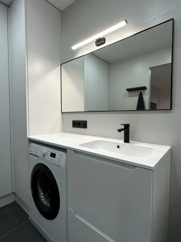 Photo collection
 Furniture inspiration from MMV Estudio
View on Instagram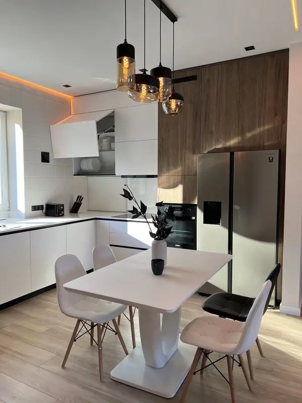 Photo collection
 Furniture inspiration from MMV Estudio
View on Instagram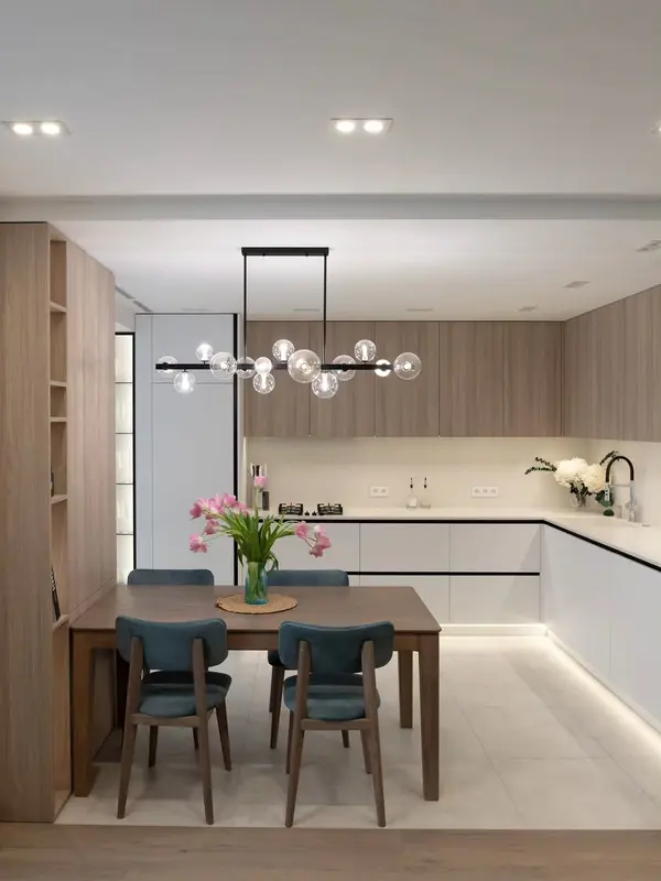 Photo collection
 Furniture inspiration from MMV Estudio
View on Instagram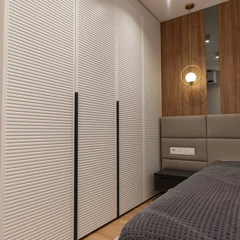 Photo collection
 Furniture inspiration from MMV Estudio
View on Instagram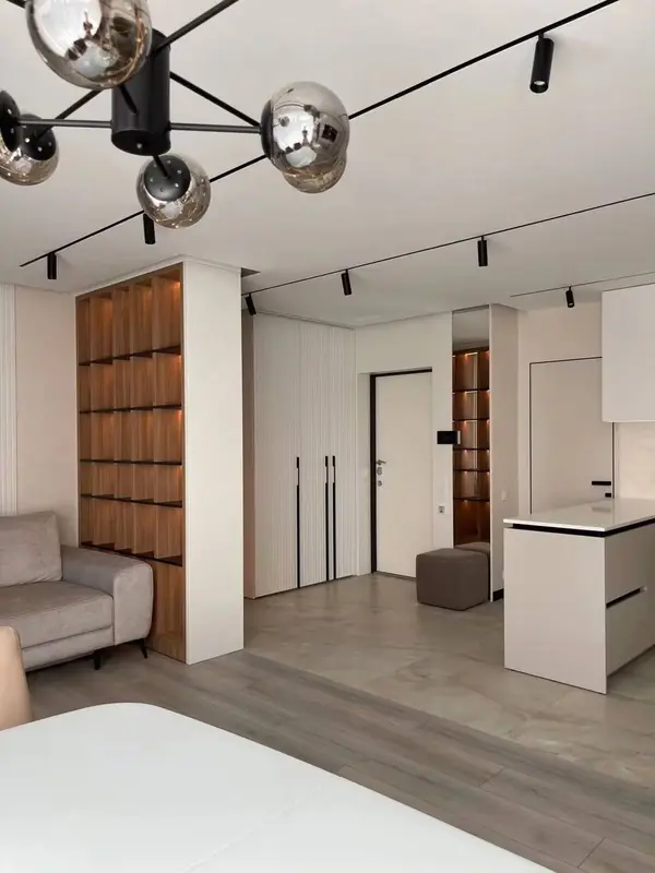 Photo collection
 Furniture inspiration from MMV Estudio
View on Instagram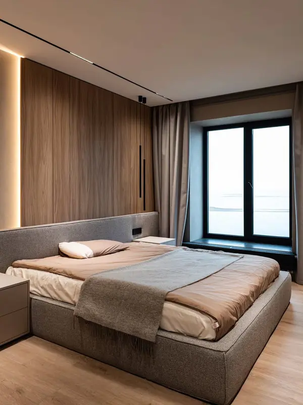 Photo collection
 Furniture inspiration from MMV Estudio
View on InstagramNo. Veneer and decorative surfaces give different timber effects. Construction follows use, care and budget.
It depends on texture, sheen and use. A handled sample is more informative than a catalogue photograph.
Yes. Scale and daylight should suit that particular home instead of imitating a coastal house.
A daylight photo, an evening view with lamps on and a photograph of the flooring you will keep help us assess a realistic palette. If you already have a sample, tell us where you want to use it.